It has become apparent from online painting lessons being requested that a post covering glazing and also misting effects is needed.
Let’s first look at GLAZING:
Glazing in this instance is another term for thin washes of transparent paint, mixed either with appropriate solvents or Retouching Varnish (if using oils).
Sometimes we might finish a painting only to find it is not quite what we hoped for – colourwise – maybe it is too cold, too dull or the colours don’t relate to one another as a whole. This can often be helped by putting a thin wash over the entire painting (or parts of it if you wish) using transparent paint. Not only does this unify the painting’ s overall colouring but it can brighten or subdue as needed.
Oil paints are best for this, although you can glaze with acrylics, but not as effectively in my opinion. Both oils and acrylics come in transparent and opaque colours and all of course are transparent to a degree when you thin them down with the appropriate medium. Here are my favourite transparent oil colours suitable to glaze with, along with directions…
![]()
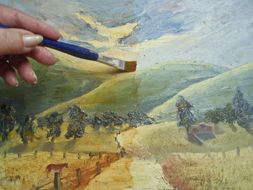
Here is a painting lacking in warmth and needing a little “sunshine” washed into it. The painting is largely blueish so I will glaze using the complementary opposite to blue on the colour wheel, which is orange.

I am going to apply a soft orange glaze with a brush first to the left hand side and will use a mixture of Indian Yellow and Crimson Alizarin oil paints, diluted with Retouching Varnish. Can you see how it is bringing this little painting to life?
As well as providing a protective finish, Retouching Varnish gives a sheen to the paint, bringing up any flat areas and enriching the darker colours. It is, to my knowledge, the only varnish safe to use on oil paintings prior to 6 months after their completion. This is because it is turpentine based and allows the paint to cure by drying out through it. It is best to apply this varnish with plenty of ventilation to avoid inhaling.
Next I take the glaze right across, covering the entire painting evenly, then with a soft rag, wipe back some of the cream highlights. Because the glaze takes about a half to 1 hour to dry thoroughly, I can remove some of it with a rag before it dries if I have have overdone the effect. Some people apply the glaze with a rag, rubbing it in a circular action all over – but I prefer to use a soft brush, only using the rag for any removal. Here is the painting fully glazed…

Now here is a picture showing the painting before and after glazing. You be the judge. Has glazing improved it? I would love to hear what you think!

This painting needed brightening up, but supposing you have the opposite problem – a painting that is too bright or strong in colour. If you take the main colouring in the painting as a guide, you can then SUBDUE it with a glaze using its complementary opposite colour on the colour wheel. There is much about mixing and using colours in Post 11, but here is a basic colour wheel to see here…

Next, lets look at MISTING effects…
Misting in this instance is like glazing, except with opaque colour instead of transparent, mixed with a little Retouching Varnish.
Sometimes as artists, we would like to soften and fade back distance in landscapes or play down parts of a painting so as to draw attention to focal points. This can be done by misting. First, here is one of my paintings in oils which has an effect of broken light in a bushland setting – to give you an idea of what I mean…

The foliage behind the trunks has been misted softly and rays of light added for drama.
How was it done? Well here is an example…the oil painting below I had discarded as a failure, being too dark and lacking in atmosphere. I decided to do what I could to save it by “rolling in the mist” and maybe some shafts of light.

First, I prepared a mix of 2 oil paints – white + indigo (a dark cool grey). I also had handy some Retouching Varnish and a soft rag. You can apply this method over oils or acrylic so long as they are dry to the touch.
There are many different greys you can use – you need to choose whether you want warm or cool grey and just how pale to mix it for your particular painting – I do suggest however that if you mix a grey with just black and white, add a little colour into it so that it doesn’t have a ‘dead’ look. The warmer the grey, the more dusty or sunlit it will look. Cooler greys suggest mist or smoke.
Can you see the soft grey at the right, which has been mixed from the 2 at left? That is the grey I will pick up on a rag to apply over the painting. I like to mix with a painting knife for a clean mix and easy wipe clean.

First dampening a small part of the rag with Retouching Varnish, I put my finger behind that part and rub it into the grey mix on the palette and begin applying it to the painting, starting at the top right hand corner…

Working my way down & picking up more paint mixed with Retouch Varnish as needed, I begin to create an effect of shafts of light as well as overall mist, by stroking with the rag at an angle…

I continue over the rest of the painting, heartened by the effect being achieved!

I realise that I’ve now overdone it and too much detail has been lost in the mist – so taking a clean dry part of the rag, I rub to remove some of the pale grey – still working at the same angle. If I need to take more off, I moisten the rag with clear retouch varnish only and rub.
I have seen an opportunity to focus on patches of dappled light as a feature in this painting and build up some softly sunlit areas. Sometimes we see this effect with early morning mist or with smoke.

Here is a close up to show the effect, which I have seen all too often in my childhood in my “little home among the gumtrees” (not unlike this one) in the Australian bush.

Ok now lets take a look at the before and after pictures and once again – you be the judge! Did misting improve it?
By the way, this is a great way to put in a whisp of smoke from a chimney or campfire in a painting or if you use a warm grey, suggest dust rising – for example around the feet of cattle or horses. I remember one of my classes were thrilled to learn this, as some were painting horses at the time and this meant they could disguise their feet, which they were having a lot of trouble with! Actually, I’ve seen some marvelous innovations by students to deal with this problem: water splashing up, dust rising, snow and long grass! Anything rather than learn how to paint their hooves properly! It has been a great source of amusement to me over the years. I’m sure in my earlier stages of learning I was guilty of it too!
Below is a diptych I painted in 2007. It has been on my wall opposite my easy chair so I have looked at it a lot. Slowly I came to wish it were softer and more mystical with cleaner lines to suit my meditational state when I sit in that chair. So, after some deliberation – down it came off the wall…

At first I set to and eliminated a fair bit of detail between the trees with a light cream paint. Then I felt the need to contrast the warm colours with cool and “let the mist roll in” to this Australian bush scene. It have loved the bush in morning mist so often as a child with the magpies carolling, that I decided that this was the effect I would try to achieve…so here it is:

Ah – now it can go back up on the wall and I know I will feel more peaceful when my eyes wander over this softened image.
Which version do you like best? After all, we are all different – so lets rejoice in our differences as we enjoy our growth and embrace all positive change.
******************************************************************
How about some overall feedback from you? Do you like these effects? Are they useful to you?
I have found them invaluable over many years, both when using oils and acrylics. It’s a great way to achieve atmosphere in paintings.
All for now and Happy Painting to you all! Don’t forget, feedback and suggestions are very welcome, as this is all in the spirit of free sharing.
Julie

Thankyou for the wonderful tips on misting, I have wondered and also asked for a while, but got nowhere.
Thankyou so much for helping me on my painting journey.
Warm regards
Nancy.
By: Nancy Ann Fletcher on May 30, 2021
at 5:04 am
I’m so glad to be of help Nancy. Enjoy your painting!
By: Julie Duell on May 30, 2021
at 12:38 pm
A big thank you all the way from India.
By: Sharin on June 18, 2019
at 2:02 am
You are most welcome! Enjoy your art.
By: Julie Duell on June 18, 2019
at 5:01 am
Thank you Julie for sharing some information, technique and tips in paintings.More power to you.
Ally
By: Ally on August 2, 2018
at 2:48 am
Thanks so much Ally.
By: Julie Duell on August 2, 2018
at 8:38 am
Thank you so much for helping me understand mist. Your illustration and descriptions are perfect. You give me the courage to actually go now
By: Edith on July 17, 2018
at 6:31 pm
Wonderful! Enjoy this magical process. Don’t forget to step back and look at it from a distance as you go. Best wishes Edith!
By: Julie Duell on July 18, 2018
at 12:11 am
Hi, I enjoyed your blog on glazing. You are very talented. I need advice. I painted a branch & birds on the sides of my cabinets with a combination of Benjamin Moore paint and acrylic. I like the way it came out except it is to bright. The primary bright colors are the sky which is white & sky blue. I would like to put a glaze on it to tone it down but I’m not sure what to do. I’m afraid to ruin it.
I bet this is a first for you. I can’t find help anywhere.
Would you be able to advise me?
By: Sharon Blandeburgo on February 17, 2018
at 1:50 pm
Sorry – I can’t advise without seeing the paintings and knowing the paints. I have never heard of Benjamin Moore paint. As a general guide, a very thin glaze of orange would be the way to tone down blue.
By: Julie Duell on February 17, 2018
at 8:53 pm
Thank You
By: Sharon Blandeburgo on February 19, 2018
at 6:34 pm
Hi Julie – thank you so much for sharing your “misting” technique. I have a painting of a figure, where the background is an impressionist mixture of leaves and flowers. This background is too bright and intrusive, so, looking for a way to tone it down, I came across your site. I’m going to try this just as soon as the paint is dry. I’m going to use Payne’s Grey (as it’s the only grey I have!), but am not sure whether to use opaque Titanium White or the more transparent Zinc White. Could you please tell me – and thank you again!
By: \Kate on January 12, 2017
at 4:52 pm
Thanks for your enquiry Kate. I would suggest the zinc white so that you can creep up on the density you want. Be sure to use a soft rag to remove some of the misting glaze if it subdues the background too much. Payne’s grey + white should be OK. I’ve never bought a grey – I just mix greys from black + white, then warm or cool them with a touch of orange or blue as desired. Best of luck. How about taking a before and after picture. I would love to see them. julieduell.artist@gmail.com
By: Julie Duell on January 13, 2017
at 12:34 am
Thanks a lot, that’s exactly what I’ve been looking for… And couldn’t find it until now. I’m painting a portrait of Virgin Mary that’s has a light all over it a — and now I know how to put it.
By: WILSON SILVEIRA on December 24, 2016
at 9:46 am
You are welcome. Glad to help.
By: Julie Duell on December 24, 2016
at 10:09 am
Hello Julie, I am so glad i found your site. I have a vintage from 70-80’s oil painting. It Is a winter scene of the woods. It has yellow glow or tint to It like the sun going down. I prefer dusk the cool tones like it just snowed.
How do i add coolness to the painting using the transparent oil? Like your painting of the trees through the woods.
Thank You Sherry
By: Shereen Pomponio on December 3, 2016
at 8:37 pm
Sorry Sherry, but I couldn’t advise without seeing the actual painting. Is it one you have painted yourself? If not, copyright might apply re the ethics of altering someone else’s work. Best wishes.
By: Julie Duell on December 3, 2016
at 10:10 pm
Oh my just what I needed to go this angel wings!!! Thank you!!
I’m a self taught starting acrylic painter trying to learn everything and anything all the time to better my skill.
By: Diana mata on October 31, 2016
at 12:47 am
That sounds lovely Diana. I hope it works for you.
By: Julie Duell on October 31, 2016
at 2:15 am
Great advice and just what I was looking for! I began painting with acrylic and oils very recently. Within the last year. My father is a pastoral landscape artist that gave me many critiques in my drawings as a child. Now the bug got me! Had to laugh hat your hooves comment! Still giggling! He would draw over my horse pictures when I was a kid! Until I learned correctly!
By: Kelly Thompson on July 31, 2016
at 5:10 pm
Lovely comment Kelly. So glad you are enjoying art.
By: Julie Duell on August 1, 2016
at 7:08 am
Hi Julie,
I love to read and gain benefit from your experience and expertise. Thank you. Your extremely helpful replies to others’ comments has given me encouragement to seek your advise. I am a very inexperienced painter, but have recently completed an oil painting of my six children. It is hanging on my loungeroom wall, but the more I look at it, the more it just seems not quite right. It is a garden setting, and seems overly green to me. Perhaps glazing with a warm red would help, but I’m scared of ruining it. Though it is very far from perfect, it is quite special to me. I don’t know if I can show it to you. Is there any way of doing that on here, or another way?
By: Robin Ramirez on June 5, 2016
at 12:49 pm
Hello Robin, Thank you for your message. If you care to attach an image of your painting to an email to me at julieduell.artist@gmail.com I may be able to help.
By: Julie Duell on June 5, 2016
at 1:09 pm
Hello Robin, Thank you for your message. If you care to attach an image of your painting to an email to me at julieduell.artist@gmail.com I may be able to help.
By: Julie Duell on June 5, 2016
at 1:09 pm
Wow!! Very peaceful and beautiful!
By: Lakshmi on March 15, 2016
at 5:08 am
Hello Julie,
Finally found a blog that gave very good examples of the process. I chuckled when you spoke of the painting that had been hanging on your wall for some time and you wanted to soften it, I do like the results. That is why I was looking for help-I have a painting hanging in my bed room and now I want to subdue or soften it. It has very bold colors of greens, purples and strong pinks. A little confused between using the complimentary colors or using a soft grey. Any suggestions
Thank you so much
Karen
By: KarenJ on February 9, 2016
at 8:20 pm
Hello Karen, I couldn’t recommend any glazing colour without seeing your painting but a soft grey sounds as though it might be the safest. I suggest you try it and if it doesn’t give you the effect you want, be ready to wash it off again before it dries. Good luck! Julie
By: Julie Duell on February 9, 2016
at 9:46 pm
Thanks so much, that is what I was thinking
By: KarenJ on February 10, 2016
at 4:38 am
It was wonderful to find your blog and discovered a lot of help. Thank you.
I am about to take an adventure with glazing medium and noticed that it is available in gloss or satin finish. Do you have a preference or perhaps use both gloss and satin?
Feeling inspired, I decided to rework a painting after reading this post and hopefully the sky will have the warm, soft appearance as your painting shown above!
Also, many of my paintings are a version of suminigashi/ebru/marbling, with rain water. Some of the pictures are in ink, others in acrylic. A few of them would look wonderful with a glaze to deepen the color in certain areas.
Do you think that glazing medium would work also, over works painted in ink? (Perhaps you have already had experience with this?)
Thanks again for your time and all the helpful gems.
Jane
By: Jane Stewart on February 8, 2016
at 7:47 pm
Hello Jane, Thank you for your enquiry. I haven’t used glazing mediums much but favour satin finish if any. All shiny finishes (including glass over a painting) require careful hanging so as not to reflect light from a window or similar. It’s a toss up as to whether this is an issue or how much you want to deepen the darks. My inks don’t need glazing as they are very colour rich as is. The answer to most questions is “try it and see” which is how I learned just about everything in art. Happy creating! Julie
By: Julie Duell on February 9, 2016
at 10:14 am
Thank you SO much for your valuable tuition.
Glazing has always been a mystery to me.
You have explained it perfectly in one easy lesson (!)
I went straight into my art room and gave my current acrylic painting (which had been puzzling me) a glaze with Burnt Sienna. It consisted of a lot of purple and blue and I wanted to mute it down a bit.
The result has ironed out all the problems for me. It looks good.
Tomorrow I am going to try the ‘smokey’ treatment with a surreal picture of dragons.
I feel motivated.
Thank you
Ruth Griffin
By: Ruth Griffin on August 2, 2015
at 7:57 pm
Thank you Ruth – I am so glad the glazing and misting is useful for you. Enjoy!
By: Julie Duell on August 7, 2015
at 9:58 pm
very usefull tips thank you sooo much dear Julie.
By: Sanaz Nabaei on April 11, 2015
at 2:42 pm
Happy new year! It was until I shellacked over my painting which had many layers of light orange glazes and it is now quite dark orange. I want to return it to a lighter colour without losing the luminosity. Can anyone suggest how I would do this? Would an oil glaze over the top lighten it? Desperate!
By: Ann on January 1, 2015
at 11:30 am
Sorry – can’t help you there. Most varnishes have a darkening effect as well, so best to try on a small test area first in future. Good luck.
By: Julie Duell on January 1, 2015
at 8:46 pm
Hello,
I am so glad that I found your blog. I was looking into purchasing a painting from Amazon that I liked but the reveiews from other customers were saying that it was dull and not like it was advertise. I wanted to see how to add a shine to the painting when I came across your blog. And it was so detailed and helpfull. Specially, when I am a complete newby to painting.
By: Dave on September 8, 2014
at 5:23 pm
Glad to have helped!
By: Julie Duell on September 8, 2014
at 10:46 pm
Good day I am so delighted I found your weblog, I really
found you by accident, while I was browsing on Askjeeve for something else,
Anyways I am here now and would just like to
say thanks a lot for a incredible post and a all round enjoyable
blog (I also love the theme/design), I don’t have time to
browse it all at the minute but I have book-marked it and also added in your RSS feeds, so when I have time I
will be back to read a great deal more, Please do
keep up the awesome jo.
By: pool liners ny on July 15, 2014
at 7:12 am
Hi Julie
I am a wannabe newby to oils. I have sooo much to learn. So many great tips. Thank you for everything. I’ll be back.
By: Elaine on October 4, 2013
at 2:24 am
You are welcome Elaine. Happy art discoveries!
By: Julie Duell on October 4, 2013
at 2:34 am
Hi. Thank you very much! The paintings look very good after the effect being added. Can you perhaps send tips for painting mist with a waterfall on a cement covered wall? Can I use the retouch varnish with normal enamel wall paint?
By: lizelle breet on August 12, 2013
at 7:14 pm
Retouch varnish is not for external use where a painting is exposed to the weather and neither are most artists’ acrylics. You need to use external house paint. To get a misted effect on your waterfall on the concrete surface, try diluting the paint (with water for acrylic or turps for oil based paint) and applying it with a rag. Good luck.
By: Julie Duell on August 12, 2013
at 10:46 pm
Hi thank you for replying. The walls are underneath a roof, it is inside a lapa. The waterfall is inside the bathroom. With what can I delute the paint to give the mist effect?
Thanks again
Sent via my BlackBerry from Vodacom – let your email find you!
By: lizellebreet@ymail.com on August 13, 2013
at 5:09 am
Hi again – I would dilute the paint with whatever solvent is recommended for it within the directions on the paint container. If it is oil based paint it should withstand steam fairly well (being in a bathroom) but acrylic may need a clear sealer over the finished painting.
By: Julie Duell on August 13, 2013
at 6:05 am
Thank you for your advice. It will sure come in handy!!!!
Sent via my BlackBerry from Vodacom – let your email find you!
By: lizellebreet@ymail.com on August 13, 2013
at 6:07 am
Hi Julie,
Thank you a thousand times for this instruction on glazing, it is EXACTLY what I have been needing to finish painting a scene of a forest fighter walking through a smokey area…I just could not figure out how to do the glaze and this is the answer.
I deeply appreciate all the wisdom and experience that you are sharing.
Cathryn
By: Cathryn Wright on February 12, 2013
at 5:38 pm
Thanks Cathryn, I am very glad to be of help. Enjoy your painting! Julie
By: Julie Duell on February 12, 2013
at 8:11 pm
Hello Julie,
Thanks .
I want to make some correction in my oil painting finally quoted with varnish. I made it about one year back.
Kindly advise.
Santosh
By: Santosh Tandon on August 2, 2012
at 7:50 am
Hello Santosh, Some varnishes are designed to be finished coats and may resist further oil paint.
The only one I know of that will definitely accept more paint over it is Retouching Varnish. If you
know what varnish it is I suggest you contact the manufacturer for advice. Best wishes, Julie
By: Julie Duell on August 2, 2012
at 10:10 pm
Madame Julie,
I was looking for glazing and misting effects in using water colour paintings. It is nice to learn its application and affect in oil painting.Dull paintings as shown- have come to life by such application. Kindly advise if similar application can be made on water colour paintings using mixed water colour of shades used by you.
Santosh
By: Santosh Tandon on August 1, 2012
at 6:53 am
Hello Santosh, I am sorry but I don’t know of any similar method of achieving glaze and mist effect in watercolour. The problem would be that once wetted again, watercolour paints will move, as will gouache.
It would be possible to use the methods described with acrylics however, which once dry become waterproof.
I hope this helps. Julie
By: Julie Duell on August 1, 2012
at 8:19 am
Hi Julie the comment & reply you have just given Wilhelmina is what I have been looking for to save my painting, that I’am doing of a sea/land picture in acrylic .Great site and loads of advise. Many thanks.
By: Dorothy on April 29, 2012
at 1:01 pm
Hello Julie. Due to allergies I work with acrylics and water only. I am working on a painting which should get mist running over the ground. Do you have any tips how I can do that best without using all kinds of chemical mediums?
By: Wilhelmina on April 26, 2012
at 6:14 pm
Hello Wilhelmina, I suggest you try a light grey acrylic mix applied wet on dry with a rag where you want the mist, a little at a time. With a soft rag you should be able to control the density or transparency of the mist by adding or taking away the grey paint. Start where it is not too critical to see if it works for you and if you don’t like the effect, wash off immediately with water on a fresh rag. Many artists use acrylic mediums when they work, but I just use water. Good luck! Julie
By: Julie Duell on April 26, 2012
at 10:09 pm
Julie, I have a large scenic oil painting that was a little to “bright”. I had someone put a “wash/stain” all over to make it not so bright and look “older”. Now, I think its way too dark…Is there anything I can use to take some of the “yellowish” stain off?
By: Shelley on April 22, 2012
at 6:39 pm
Hi Shelley, I’m sorry I can’t help you with advice to remove some of the “wash/stain” without knowing it’s composition. Best to contact the person who applied it. Good luck.
By: Julie Duell on April 23, 2012
at 8:28 am
Dear Julie, your instructions helped me so much. I am a Painter Wannabe and as I looked at my attempt I couldn’t figure out how to paint “sea smoke” which is a sailor’s term for mist coming off the water. Now I know how to proceed. Thanks Julie, I really appreciate it. Although I didn’t understand all the terms, I’ll figure it out as now I know where to begin!!! I’m finishing a painting I put aside for 3 months, thanks to you…
By: Connie on January 29, 2012
at 12:39 am
Hello Connie, That’s great! How about sharing your results (on-line or off – your choice) per email attachment: jduell@pnvr.com.au Happy painting! Julie
By: Julie Duell on January 29, 2012
at 2:03 am
I am painting a man feeding pigeons on a park bench.
the background is too detailed and visible and cold. I would like it to be further in the distance and the figure to be intimate and warm. Oil on canvas.
greetings
Wilna
By: Wilna Grobler on September 22, 2011
at 12:12 pm
Thank you Wilna. I have replied in some detail by email re possible solutions to your painting problem. Please let me know how you get on or if I can be of further help. Please remember that all glazing must be done wet over dry. Julie
By: Julie Duell on September 23, 2011
at 12:10 pm
Good morning Julie, from South Africa.I was thrilled to “stumble” on your website just as I was wondering how to get more warmth in a painting. I would really love to receive your mail regularly, or how does it work? I am not too clever with technology
By: Wilna Grobler on September 22, 2011
at 7:05 am
Hello Wilna, Nice to hear from you. The site is set up so that each post deals with a different topic. However I am accessible for conversation through the comments boxes as you have done. I will email you separately about the warmth in your painting. Julie
By: Julie Duell on September 22, 2011
at 10:44 am
By the way. Your art work is so nice and beautiful. I just love it so much.
By: Samantha Rivera on March 21, 2011
at 5:03 pm
Hello Joan, i have a question. I am still at highschool and i have to complete 24 art paintngs but i have my concentration to finish. so, i have to show growth throughout my paintnigs and i am stuck. my concentration is about showing people the forest and the color as well, also i have like a mystical thing going on. But i need help for some ideas. Can U help me?
By: Samantha Rivera on March 21, 2011
at 5:02 pm
Hi Samantha! Would it be appropriate to use the Australian bush as your theme? If so, you could focus on a bush fire and then the regrowth afterwards, using close ups of the changes for your artwork. Northern hemisphere forests lend themselves more to seasonal changes – the bare limbs in winter, fresh new leaves in spring, flowering in summer and falling leaves in autumn. Did you know that the Australian eucalypts (gum trees) survive bush fires whereas conifers (pine trees) have to grow again from the seeds in their pine cones? Good luck! Julie
By: Julie Duell on March 21, 2011
at 9:52 pm
I thankyou for this information, it is what I have been looking ofr. I love your art.
Where do I get retouching varnish. I love in Sydney
Christine
By: christine on September 4, 2010
at 1:28 am
Hi Christine, Thanks for your comment. You can get retouching varnish at most Art materials shops (like Eckersleys). It dries very shiny – if you want it less shiny dilute with just a little bit of pure turpentine. Julie
By: Julie Duell on September 4, 2010
at 4:48 am
Just a note to say a heartfelt thankyou for your excellent site. Your tutorials/advice are clear and succint yet very informative and useful. Your generosity and willingness to share your knowledge in such a genuine way is tremendously appreciated.
By: Bill on February 19, 2010
at 12:29 pm
Great tips Julie! I am a watercolor/graphite artist just starting with acrylic and really enjoyed reading your tips. I KNOW they are going to help me out immensley!
Happy painting!
Tracey
By: Tracey on August 20, 2009
at 5:44 am
Thank you for you quick reply. I’ll try both it is still tacky so mabe the first will work. I’m slow but I will get back to you. Joan
By: Joan on August 15, 2009
at 6:14 pm
I appreciated you clear answers to Selah’s questions. I saw a demo on another sight of glazing to show rocks under a stream. I just used linseed oil for the medium and prussian blue (my first attempt at glazing) The undercoat and rocks were done in raw seinna. (If I’d read more I would have been better prepared) The result left the water area and rocks still very orange. After it dried I applied a 2nd coat. But now I’ve lost the light areas and the water is too dark.
Sorry to take so long to get to my question. But can I fix this with the touch up varnish and lighter color or should I stubble in the light areas. Do you have another sggestion? I now know I should have wiped the glaze off the lighter areas while it was wet — too late now. I am so pleased with the rest of the painting I hate to give up
By: Joan on August 14, 2009
at 9:57 pm
Hello Joan. Thanks for your question. It’s hard to advise without seeing your work, but perhaps you could try dissolving a little of the glaze over the light areas by rubbing carefully with a rag moistened with solvent. If it works and you are left with differing degrees of shine, you could even that out with clear Retouch Varnish.
If rubbing back doesn’t work I can’t imagine any other way to restore lighter tones other than to add them back in again by painting, scumbling etc. Please let me know how you get on. Good luck! Julie PS.Prussian blue is a very strong colour that I usually use mix with others such as Indian yellow & Viridian.
By: Julie Duell on August 15, 2009
at 1:46 am
I really like the way you added the mist to the picture. I was going to add rays of sunlight to a wrought gate with flowers, but will this technique work over flat household paint? Thank you.
By: connie on March 24, 2009
at 3:19 pm
Hello Connie – The only way to find out is to try it! I suggest you have a clean rag dipped in solvent to suit the paint you are using, so that if you don’t get the effect you are after you can wipe it off gently straight away. You didn’t say whether the housepaint is oil or water based. Just remember that oil paints take over water based but not vice versa. It sounds like a lovely subject. Good luck. Julie
By: Julie Duell on March 26, 2009
at 12:09 am
brilliant side
By: sanna on February 13, 2009
at 12:25 am
I really enjoy your website. I was looking for how to use Retouching Varnish. I need to fix a painting from 27 years ago, and I didn’t seal it. I picked up the retouch varnish in hopes I could use it for that purpose. Looks like there are many more uses for it.
Thankyou for sharing your knowledge, generously.
Cathy
By: Cathy on February 11, 2009
at 5:54 am
Many many thanks Julie ! God bless !
By: Saleh on December 10, 2008
at 4:59 pm
Thank you very much Julie !
And one more question – if you dont mind. Some authors write that it is possible to lay new coat just another day or 2 days later -when previous one is not dry yet and is not wet.Is it right approach ? Sorry for disturbing you again)
By: Saleh on December 10, 2008
at 12:31 pm
My pleasure Saleh… I presume your last question refers to oil paint. If so, one should ideally work from “lean to fat” letting each coat become dry before adding the next. By lean to fat, I mean that in the first underpainting the paint can be diluted with a non oily solvent (I used to use turpentine but now use an odourless solvent) The top layer should either be applied undiluted at tube consistency or with a little Linseed Oil (or equivalent). That way, the paint will dry and cure properly.
Only a temporary varnish (for example – Retouch varnish) should be applied (if any) within 6 months if the paint is thickly applied. Permanent varnishes can seal away the air and trap wet paint within the thickness of the layer, preventing long term drying. 6 months curing time is considered safe.
Technically, we can use oil based paint over water based paint (but not the other way around.) It is therefore my own preference to do any underpainting in acrylics (which dry very quickly) and proceed with the final coat in oils. This minimises waiting time during the painting process. Of course all the water based paints such as Watercolour, Acrylic, Gouache and Poster paint can be painted over as soon as they are dry or even in the process of drying if you want to blend wet into wet. Hoping this helpful. Happy painting! Julie
By: Julie Duell on December 10, 2008
at 12:55 pm
Hello!
Excellent site! Dear Julie could you kindly explain some things:
so – what is the difference between “mixing colours on the canvas” and “new coat” (in a-prima). (As I cabtmake any “new coat” without mixing on canvas). Does it interchangeable meanings, or are them different (in alla-prima) ? In other words: really – are there any few coats in alla prima, or it’s all – adding and mixinng into same wet layer ? by the way adding_in and mixing_in – are the same for oil painting?
I guess that (adding= new layer OVER wet one), and (mixing=addition INTO wet layer) ? And finnally – “classic” alla-prima should have only one layer? or coat ? or is it also interchangeable meanings ?
Ive read TOONNES of artbooks, but no one describes it clear.
May be I mistaken, but I believe that not only the painting but also theory shoud clear.
OR even more shortly : COAT-LAYER-OVERwet-INwet -what are the exact dispositions (OIL)? Like in your excellent schemes for maxing(11)
Sorry for bad english, but I dont know any paintor around, to consult all this subjects. Kind regards !
By: Saleh. from Caucasus on December 9, 2008
at 7:36 pm
Hello Saleh
Thank you for your enquiry. I will do my best to clarify. As I understand it,
“A la prima” means painting directly onto a canvas without using a drawing or underpainting, usually using paint from the tube without pre mixing.
“A la prima” can mean “one coat only” or “first coat”.
“Classic a la prima” means one coat only.
“Mixing colours on the canvas” means mixing wet into wet by blending them together on the canvas.
“New coat” means over-painting a new coat with wet paint over a dry layer.
Painting a la prima has been usually used outdoors to save mixing time when painting “plein air” on site.
An example of classic “a la prima” painting would be some of the pointellist paintings by the French Impressionists, where they would apply
many dots of primary colours and white next to each other to give the impression of other colours when looked at by standing back.
For example green might be painted as dots of blue, yellow and white.
The eyes of the viewer do the “mixing” to make the green.
Hoping that helps a little. Best wishes, Julie.
By: Julie Duell on December 9, 2008
at 10:53 pm